
With much fanfare, Google released the next iteration of Material Design: Material You. It’s received mixed reviews, but I found it extremely pleasant to use and the homogeneity of Google apps following the platform colors felt great. That’s what prompted me to update APS to Material You and join in :)
As expected, the library ecosystem (specifically the material-components-android library) took a while to support Material You but with the 1.5.0-alpha05 release of the MDC Android library, things are finally at a place where migration to Material You (henceforth referred to as M3) is viable for simpler apps like APS.
APS has had some design work done to it but for the most part remains the culmination of ad-hoc choices (often bad) over a period of several years. With this migration I sought to change that and make things a bit more cohesive as well as give the app some much needed oomph.
Getting the basics in
I began with scouring through the resources in the conveniently isolated M3 website, where the Material Design team has helpfully created a lot of great tools and content to help developers and designers through the process. There’s the “Migration to Material 3” blog post, and the Material Theme Builder to generate palettes/styles/themes for apps, for both Jetpack Compose and Android’s View-based system. These were extremely helpful in getting a headstart on the whole process. It’s all documented in the commit history of the migration PR but I figure some additional context can’t hurt.
Once I had the themes in, I decided to take the opportunity to also introduce a custom typeface. The app has been using Roboto since forever and it felt like it was time to spice things up. I decided to go with Manrope since it is a font I’ve previously used and found to be excellent for visual appeal and accessibility. I’m still not a 100% confident in my choice, so if people have better options in mind I’d love to know down in the comments.
Once the new font face was in, I opted to enable dynamic colors. Admittedly not the right choice, since I should’ve validated the “default” palette first but that’s what I did ¯\(ツ)/¯.
Bugfixes and improvements™️
Once the M3 themes were all prepped, it was time to actually start migrating.
I switched our activities to use the M3 themes, and immediately started noticing bugs from non-idiomatic and straight up incorrect theming we’ve been lugging around for the past couple years.
First step was to update our iconography, which was using inconsistent tints throughout. I updated all of them to use ?attr/colorControlNormal which made them blend in correctly with the rest of the updated UI.
Earlier this year we had migrated a selection UI in one of our screens to use Chips, but we never got the theming right so it always looked kind of wrong. With M3, we were able to revert back to MaterialButtonToggleGroup without regressing on the accessibility issue which made us do it in the first place.
There were a lot more smaller changes that were made to address the remaining visual bugs
- Our onboarding flow was using an incorrect interpretation of
?attr/colorPrimaryfor theming, and was migrated to use?android:attr/colorBackground - A lot of screens were using hard-coded colors, which were migrated to theme attributes
- Many screens used hard-coded styles for buttons and text fields, and were also migrated to theme attributes
- Multiple layouts also referenced typography styles directly and were migrated to the corresponding M3 attributes, based on the mapping table in the “Migration to Material 3” article.
- System bars and Toolbar had to be given explicit styles and colors to match the “flat” aesthetic from our M2 designs.
The final stretch
With the visual fixes out of the way, I went in and cleaned up the themes and styles. I commonized shared attributes such as fonts and widget styles, created M3 variants of other special-purpose themes we had, and got rid of all the now unused M2 theming. Overall, the PR touched 60+ separate files and generated a final diff of +603,-314 lines. The PR can be seen here.
We use a third-party library by Max Rumpf called ModernAndroidPreferences for our settings UI, and it hard-coded the use of AppCompat dialogs. Max was extremely helpful and made that customisable for us over the weekend which allowed us to use the appropriate Material You dialogs consistently. Huge thanks to Max, and check out his library! <3
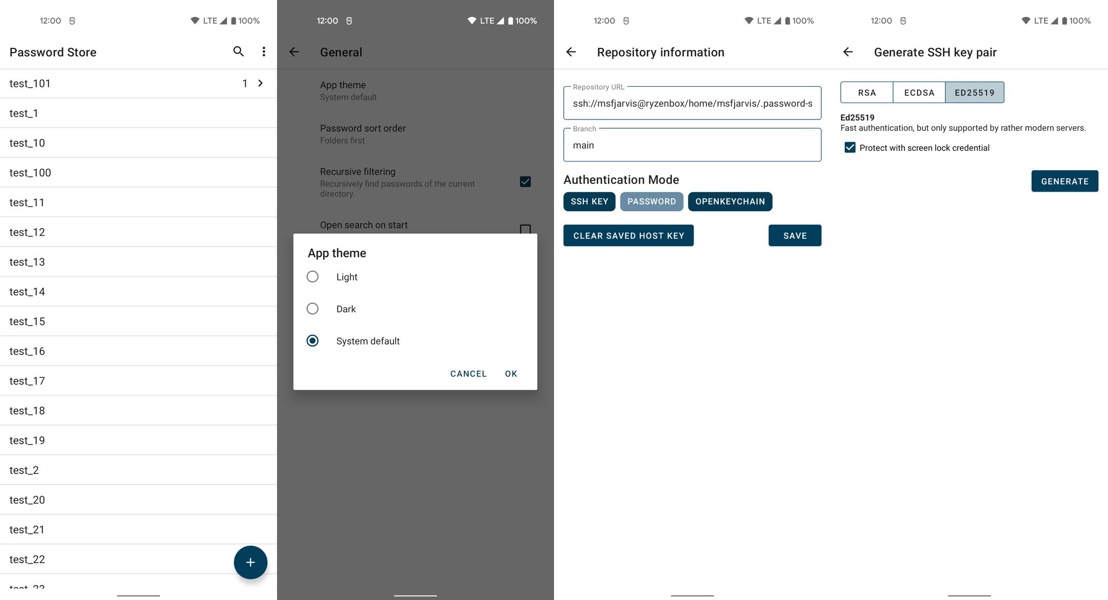
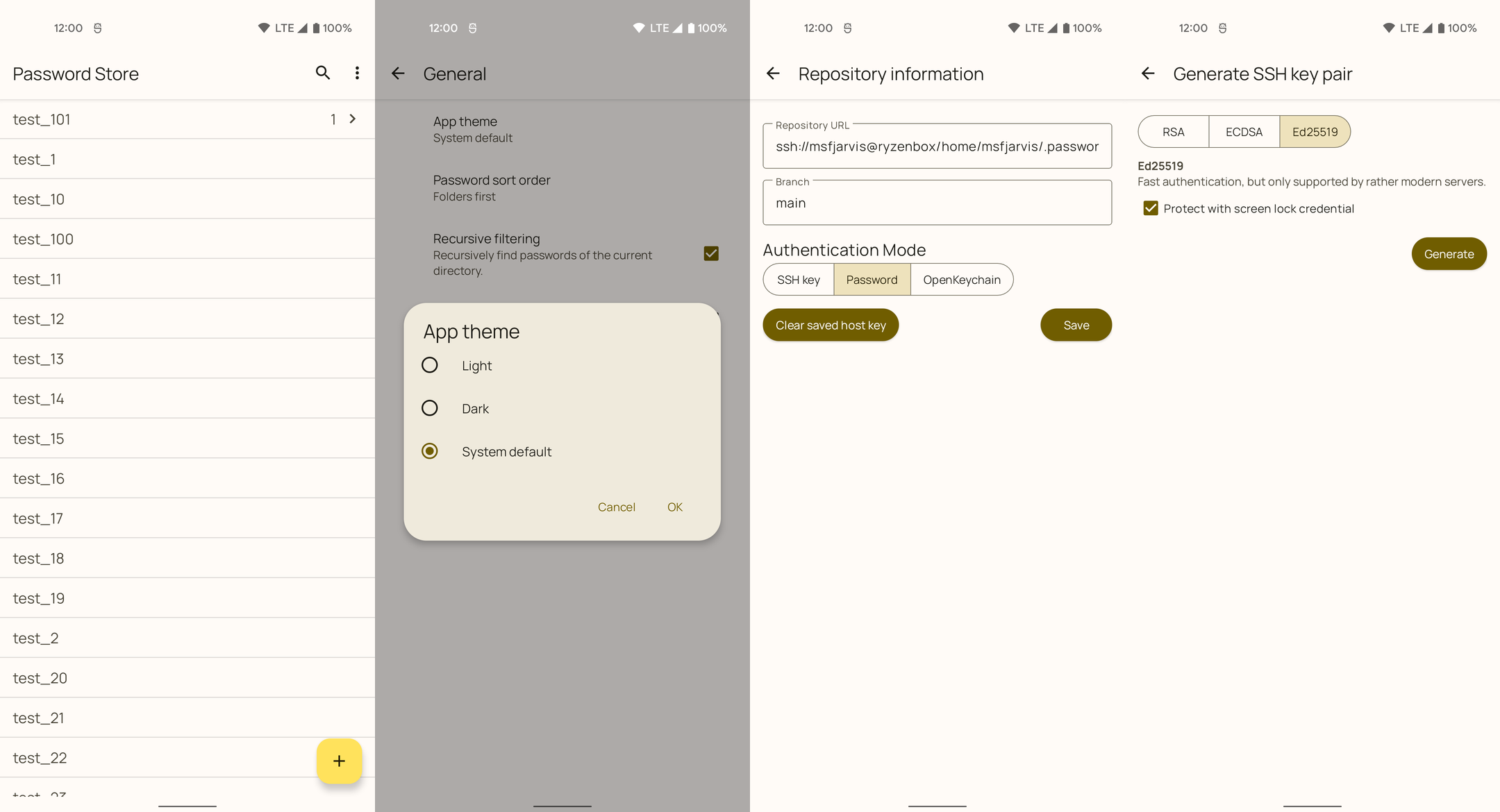
Screenshots!
Before
After
Closing notes
APS is a very low-effort app when it comes to UI work. We do not have a custom design system, everything follows Material to a T, and we try to stay in that lane. Our migration took me around 9 hours of work over two days, most of which was really spent on menial work such as manually checking all layouts for hard-coded styles and replacing them with attributes. This isn’t representative of what this process would look like for any project which rolls its own design system on top of Material, since they have a lot more to do before they can even begin the migration of their screens.
I’d like to thank the Material Design team once more for the fabulous work they have done both in creating Material You as well as the technical documentation around it. Material Theme Builder was an extremely crucial tool for me that set the tone of the whole process, and I would have certainly repeated the same mistakes I did with Material 2 if it wasn’t for the tooling and guidance from the team.